| View previous topic :: View next topic |
| Author |
Message |
CWBoarder691
Criminal

Joined: 17 Jul 2004
Posts: 88
City: Houston
|
 Posted: Aug 24, 2004 5:07 pm Post subject: Logo Posted: Aug 24, 2004 5:07 pm Post subject: Logo |
 |
|
Hey whats goin on ive been making a new company its been around for about a month or less right now im mainly doing videos but im hoping in the future for apparel and wakeboards. but this is all besides the point im trying to decide on my logo well this is what i have got. Any suggetions would be great and your own logos will be also much appreciated

|
| Description: |
|
| Filesize: |
37.38 KB |
| Viewed: |
6588 Time(s) |
|
|
| Back to top |
|
 |
|
|
Tyler~Moore
Wakeboarder.Commie

Joined: 30 Dec 2003
Posts: 1941
City: Knoxville
|
|
| Back to top |
|
|
CWBoarder691
Criminal
Joined: 17 Jul 2004
Posts: 88
City: Houston
|
| Posted: Aug 24, 2004 5:32 pm Post subject: |
|
|
would this be better

|
| Description: |
|
| Filesize: |
25.97 KB |
| Viewed: |
6567 Time(s) |
|
|
| Back to top |
|
|
Bowen
Wakeboarder.com Freak

Joined: 12 Apr 2004
Posts: 3708
City: Dallas...I miss SoCal
|
| Posted: Aug 24, 2004 5:40 pm Post subject: |
|
|
You're moving somewhat in the right direction, but if you wanna have a logo, IMO, it has to be image and writing in one...You can't have the text outside of the image, there has to at LEAST be some overlapping between the two. Try writing "Star Wakeboard Industries" with like a shooting star behind it, or somehow incorporate a star into it.
This is constructive criticism, I think its great that you are trying to start this at such a young age. Also, just a sugestion, use a play on words, and open your target audience...change it from wakeboard to 'board'...there for you could use a play on words and call it "starboard industries" or "star-board inudustries" or something like that.
Take it or leave it, its just a suggestion.
|
|
| Back to top |
|
|
Liquid*Force*Rider
Wakeboarder.com Freak

Joined: 26 Jan 2004
Posts: 3139
City: Okanagan Valley, B.C Canada
|
| Posted: Aug 24, 2004 5:45 pm Post subject: |
|
|
make i basic
cheaper yo make sticker out of if you ever are
_________________
www.Crawlinbc.com |
|
| Back to top |
|
|
CWBoarder691
Criminal
Joined: 17 Jul 2004
Posts: 88
City: Houston
|
| Posted: Aug 24, 2004 6:01 pm Post subject: |
|
|
| any other criticism i cant post the updated logo to big but yeah keep em comin
|
|
| Back to top |
|
|
RUSSIAN
Wakeboarder.com Freak

Joined: 12 Jan 2003
Posts: 4081
City: NOR*CAL
|
| Posted: Aug 24, 2004 6:26 pm Post subject: |
|
|
| WCR wrote: | make i basic
cheaper yo make sticker out of if you ever are |
WTF did you just say 
_________________
http://www.integrity-wake.com
| K-dub wrote: | | DRAGON88, everyone shall now call you Tinkerbu'.... |
|
|
| Back to top |
|
|
wkbrd
Outlaw

Joined: 02 Mar 2003
Posts: 104
|
| Posted: Aug 24, 2004 6:27 pm Post subject: |
|
|
| ok. I don't have photoshop so this kind of look bad, but what I'm brignin is the concept of makin the frame of the star with the leters swc
|
|
| Back to top |
|
|
wkbrd
Outlaw
Joined: 02 Mar 2003
Posts: 104
|
| Posted: Aug 24, 2004 6:29 pm Post subject: |
|
|
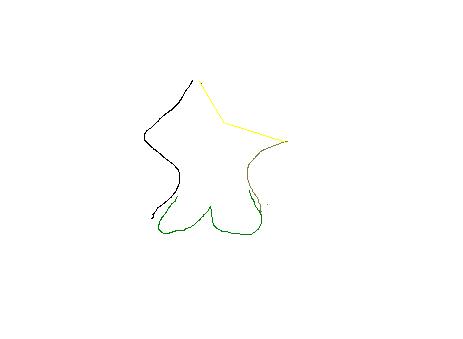
dunno why the image won't show...
|
| Description: |
|
| Filesize: |
5.67 KB |
| Viewed: |
6524 Time(s) |
|
|
| Back to top |
|
|
Bowen
Wakeboarder.com Freak
Joined: 12 Apr 2004
Posts: 3708
City: Dallas...I miss SoCal
|
| Posted: Aug 24, 2004 7:05 pm Post subject: |
|
|
 That looks like really Saggy... That looks like really Saggy...
keep tryin'
|
|
| Back to top |
|
|
Liquid*Force*Rider
Wakeboarder.com Freak
Joined: 26 Jan 2004
Posts: 3139
City: Okanagan Valley, B.C Canada
|
| Posted: Aug 25, 2004 7:06 am Post subject: |
|
|
make it basic
cheaper to make sticker out of if you ever are going 2
_________________
www.Crawlinbc.com |
|
| Back to top |
|
|
Victor
Outlaw

Joined: 23 Apr 2003
Posts: 182
City: Växjö
|
| Posted: Aug 25, 2004 8:44 am Post subject: |
|
|
wkbrd: I like it! pretty good stuff!!
_________________
y0 |
|
| Back to top |
|
|
Lake Rabbit
Outlaw
Joined: 17 May 2004
Posts: 189
City: Indian Lake
|
| Posted: Aug 25, 2004 2:36 pm Post subject: |
|
|
Perhaps just a yellow star.... the star looks kinda cheesy. But I love your idea for a board company name.
_________________
Lifes a garden, dig it. You just gotta keep on keepin' on! |
|
| Back to top |
|
|
CHiLi DaWg
Wakeboarder.Commie

Joined: 12 Dec 2003
Posts: 1674
City: Huntington, IN
|
| Posted: Aug 25, 2004 3:02 pm Post subject: |
|
|
I think the 1st star logo is ok, but would be better if you could mesh the words in with the star. Maybe do funky lettering instead of the plain stuff.
_________________
| churchy wrote: | | You would be a big hit with the lesbians. |
|
|
| Back to top |
|
|
CWBoarder691
Criminal
Joined: 17 Jul 2004
Posts: 88
City: Houston
|
| Posted: Aug 25, 2004 4:40 pm Post subject: |
|
|
| alright ill try all these ideas
|
|
| Back to top |
|
|
CWBoarder691
Criminal
Joined: 17 Jul 2004
Posts: 88
City: Houston
|
| Posted: Aug 25, 2004 4:51 pm Post subject: |
|
|
Yeahs heres the new one

|
| Description: |
|
| Filesize: |
25.4 KB |
| Viewed: |
6277 Time(s) |
|
|
| Back to top |
|
|
colefooter
Wakeboarder.com Freak
Joined: 22 Jun 2003
Posts: 3925
City: Fairborn, OH.
|
| Posted: Aug 25, 2004 5:04 pm Post subject: |
|
|
| CWBoarder691, thats pretty cool, much better than the older one
|
|
| Back to top |
|
|
CWBoarder691
Criminal
Joined: 17 Jul 2004
Posts: 88
City: Houston
|
| Posted: Aug 25, 2004 5:08 pm Post subject: |
|
|
| man this whole making a logo thing is harder than i thought
|
|
| Back to top |
|
|
DavidHoff
Wakeboarder.Commie
Joined: 03 May 2004
Posts: 1855
City: Dallas
|
| Posted: Aug 25, 2004 5:09 pm Post subject: |
|
|
Thats better but make the star texture itself more appealing. I did this to give you an idea of something a tiny bit more complex.

|
| Description: |
|
| Filesize: |
144.05 KB |
| Viewed: |
6267 Time(s) |
_________________
www.Tigeowners.com
www.dallaswakeboarding.com
www.tbks.us |
|
| Back to top |
|
|
CWBoarder691
Criminal
Joined: 17 Jul 2004
Posts: 88
City: Houston
|
| Posted: Aug 25, 2004 5:35 pm Post subject: |
|
|
Heres another one its alot different

|
| Description: |
|
| Filesize: |
56.39 KB |
| Viewed: |
6251 Time(s) |
|
|
| Back to top |
|
|
HYPERLITE_103
Criminal

Joined: 11 Aug 2004
Posts: 90
City: Windsor
|
| Posted: Aug 25, 2004 5:35 pm Post subject: |
|
|
i like the blue one the best..nice work
_________________
www.jetpilot.com |
|
| Back to top |
|
|
CWBoarder691
Criminal
Joined: 17 Jul 2004
Posts: 88
City: Houston
|
| Posted: Aug 25, 2004 5:51 pm Post subject: |
|
|
Yay another one

|
| Description: |
|
| Filesize: |
80.72 KB |
| Viewed: |
6238 Time(s) |
|
|
| Back to top |
|
|
DavidHoff
Wakeboarder.Commie
Joined: 03 May 2004
Posts: 1855
City: Dallas
|
|
| Back to top |
|
|
CWBoarder691
Criminal
Joined: 17 Jul 2004
Posts: 88
City: Houston
|
| Posted: Aug 25, 2004 6:02 pm Post subject: |
|
|
| Adobe illustrator CS
|
|
| Back to top |
|
|
Powaman
Outlaw
Joined: 04 Jul 2004
Posts: 170
City: escanaba
|
| Posted: Aug 25, 2004 6:20 pm Post subject: |
|
|
Hmm tommorow I'll make one with photoshop. I guarentee It'll top em all 
|
|
| Back to top |
|
|
CWBoarder691
Criminal
Joined: 17 Jul 2004
Posts: 88
City: Houston
|
| Posted: Aug 25, 2004 6:28 pm Post subject: |
|
|
| I havent even tried photoshop yet
|
|
| Back to top |
|
|
CHiLi DaWg
Wakeboarder.Commie
Joined: 12 Dec 2003
Posts: 1674
City: Huntington, IN
|
| Posted: Aug 25, 2004 6:52 pm Post subject: |
|
|
CWBoarder691, Like it better now  Try expanding the letters outside of the star also. Just to break the form a bit. Tell me what you think. Try expanding the letters outside of the star also. Just to break the form a bit. Tell me what you think.
_________________
| churchy wrote: | | You would be a big hit with the lesbians. |
|
|
| Back to top |
|
|
CWBoarder691
Criminal
Joined: 17 Jul 2004
Posts: 88
City: Houston
|
| Posted: Aug 25, 2004 7:09 pm Post subject: |
|
|
Like this

|
| Description: |
|
| Filesize: |
81.37 KB |
| Viewed: |
6189 Time(s) |
|
|
| Back to top |
|
|
Erik
Old School Freak

Joined: 10 Mar 2003
Posts: 2830
City: Boston MA, Wolfeboro NH, DelRay FL, Montego Bay, Jamaica
|
| Posted: Aug 25, 2004 7:27 pm Post subject: |
|
|
How about this? I think I win...

|
| Description: |
|
| Filesize: |
28.9 KB |
| Viewed: |
6186 Time(s) |
|
|
| Back to top |
|
|
DavidHoff
Wakeboarder.Commie
Joined: 03 May 2004
Posts: 1855
City: Dallas
|
|
| Back to top |
|
|
aceyx
Addict


Joined: 30 Mar 2004
Posts: 770
City: dirty
|
| Posted: Aug 25, 2004 7:56 pm Post subject: |
|
|
why not just use a yellow star and call it "star wakeboard" rather than having the name anywhere?
i can think of hundreds of company logos i can recognize without having to be literate (texaco, shell, mcdonalds, pepsi, etc)
|
|
| Back to top |
|
|
BrandonC
Addict

Joined: 25 Jul 2004
Posts: 539
City: Murrieta
|
| Posted: Aug 25, 2004 8:19 pm Post subject: |
|
|
| It looks like someone just downloaded Adobe and wants to be an advertising wizard. Hire a prosfessional to do this. Your logo is the single most important visual of your business and you're trying to fart around with programs you dont know how to use. Not to be harsh, but you don't even appear to have any creative juices.
|
|
| Back to top |
|
|
M3Orion
Addict

Joined: 18 Jul 2003
Posts: 670
City: Bay Area
|
| Posted: Aug 25, 2004 8:38 pm Post subject: |
|
|
Building off of what BrandonC said, you should really learn how to use everything that Photoshop has to offer before creating your logo. Spend a lot of time messing around with EVERYTHING in the program.
_________________
 |
|
| Back to top |
|
|
Jensen
Wakeboarder.com Freak
Joined: 06 Jul 2004
Posts: 3108
City: Chico
|
| Posted: Aug 25, 2004 11:39 pm Post subject: |
|
|
| ya, just mess around and see what you can come up with. I see colefooter, has been having fun with photoshop, seems to come up with a new signauture pic all the time. Hey Erik Jernberg, make me a cool logo like that
|
|
| Back to top |
|
|
Dutch
Addict

Joined: 24 Feb 2004
Posts: 589
|
| Posted: Aug 26, 2004 4:40 am Post subject: |
|
|
| M3Orion wrote: | | Building off of what BrandonC said, you should really learn how to use everything that Photoshop has to offer before creating your logo. Spend a lot of time messing around with EVERYTHING in the program. |
If you guys want some advice on creating your own logo then just look at how the professionals make theirs. First off, they don't make logos with Photoshop, you make them with programs like Illustrator or Macromedia Freehand or some form of vector graphic program.
You want your art work to be scaleable and not in a bitmap format where you can't upsize your art. (If I just lost you with that last line, then Google Vector art vs. Bitmap art and find out what the difference is.
If it's your logo then you'll want to be able to use it on multiple media formats, like shirts, stickers, web and whatever else you can think of to put it on.
Check out http://www.logo-mojo.com/html/logo_design.html to get some good ideas of good logo design. Go through their portfolio and see how a graphic designer makes them.
One last thing, using Photoshop filters when designing a logo is usually a bad thing. It looks like can'd art or clip art if you do that. Try getting a logo printed up on a t-shirt if you have a small brick pattern inside a star. The printer will laugh at you as soon as you walk out the door, or he'll just charge you an obscene amount to attempt it.
Hope this helps.
|
|
| Back to top |
|
|
|
|
|

